Design Process
Formative Research
We started with our initial research about the problem space by going through multiple research papers, articles online about the physical inactivity in white-collar workers.W interviewed two experts from this field who provided their perspectives on such a complex issue and helped us analyze the depth of the problem. We aimed to find out existing solutions, the persistent challenges, things that worked and didn't work, and why. From these activities, we were able to familiarize ourselves with the problem, which helped us plan our user research.
User Interviews
We brainstormed and formulated the interview protocol with particular objectives for the type of data we were looking for. We then conducted semi-structured interviews with the six participants that matched our target user group - 'white-collar workers.' During our interviews, we focused on learning the following things about the target user:
01.
Food habits
02.
Knowledge about possible diseases
03.
Level and types of Physical activity
04.
Stress factors
05.
Motivations/frustrations associated with the use of existing technology in this space
Observations
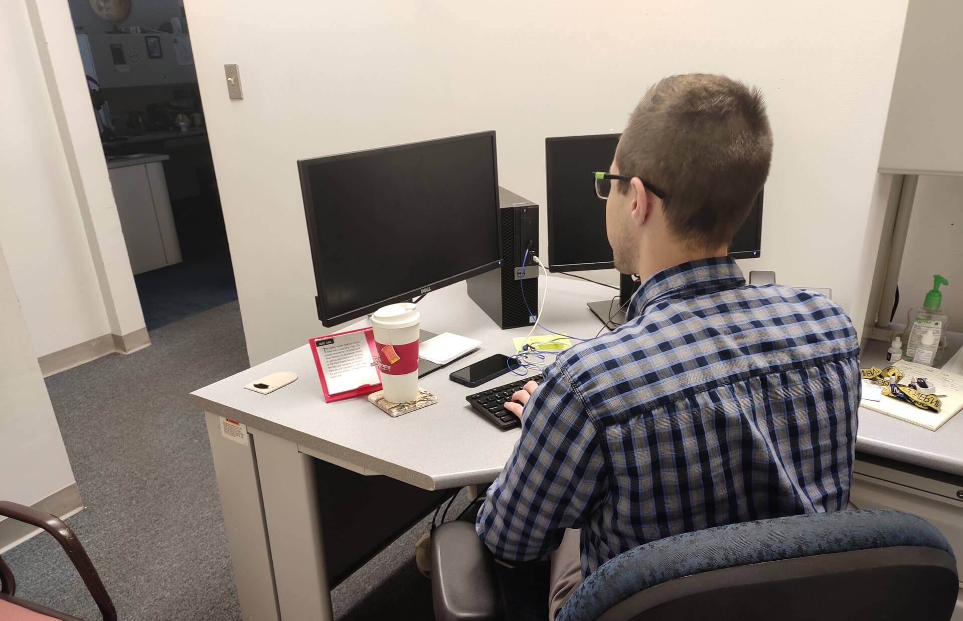
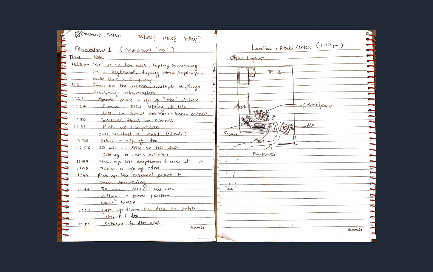
We also conducted six observations where we observed the behavior of our target users in their natural setting. During each observation, we took down the notes and depicted the scenes in rough sketches to record our sessions. The observations helped us analyze the behavior pattern of the users in the office environment.
Analyzing the collected data
Once we finished our data collection, we performed an analysis method to make sense of all the gathered information. We collaboratively conducted an affinity diagramming session to find emergent themes and patterns among the data.
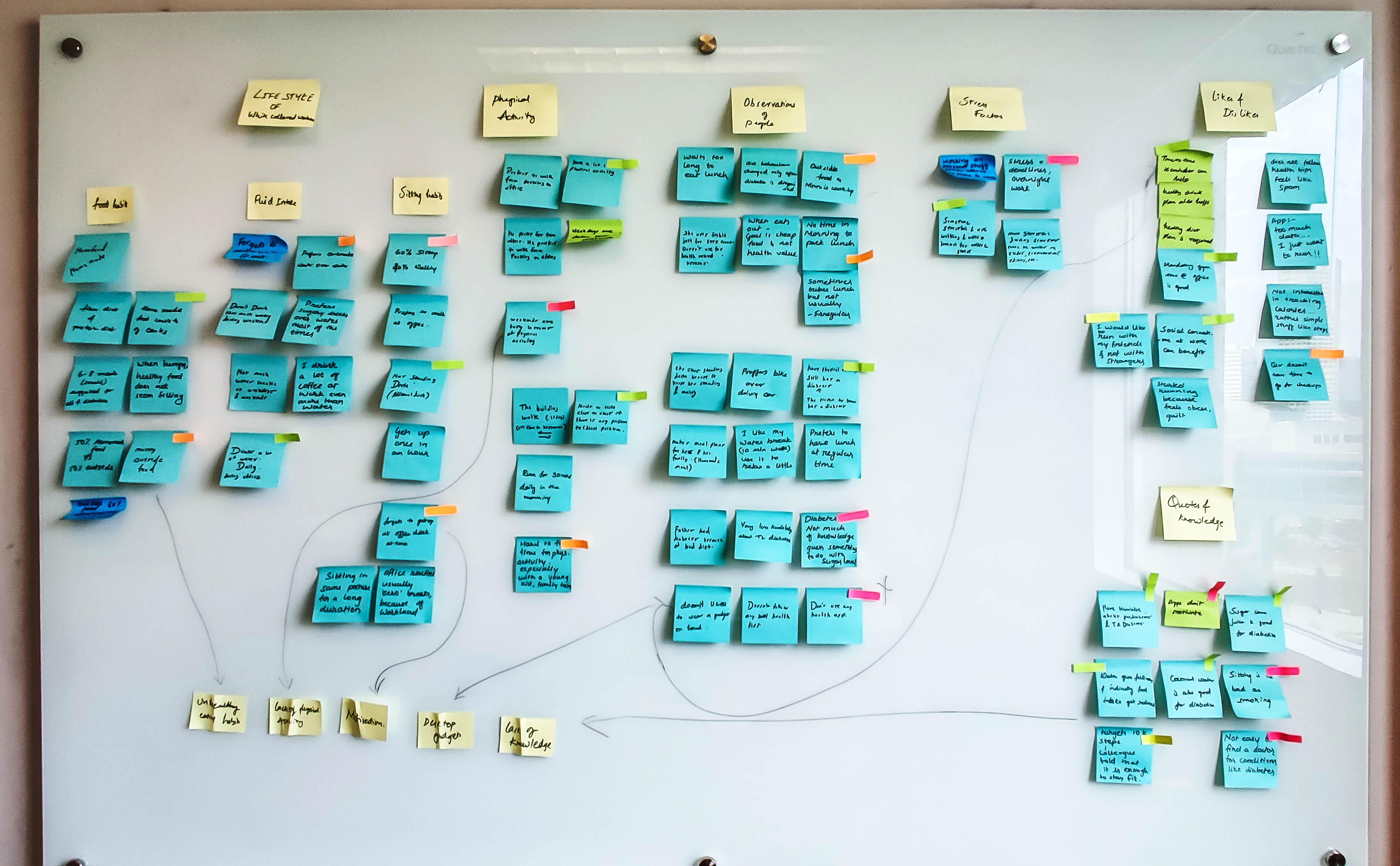
We discovered following three key problem areas from our primary research
Physical Inactivity
Due to sedentary lifestyle, white-collar workers deal with physical inactivity
Unhealthy Diet
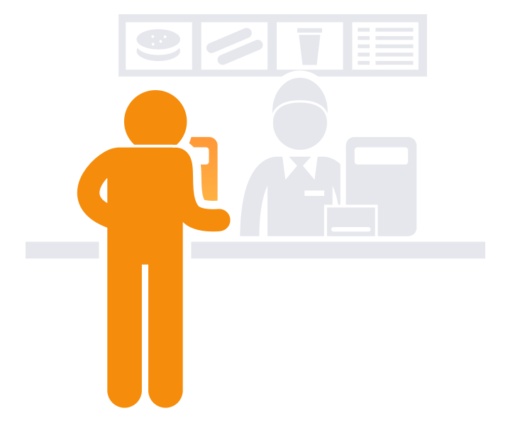
White-collar workers often compromise diet due to their busy schedules

Lack of Awareness
They are not aware of health risk associated with sedendary behavior
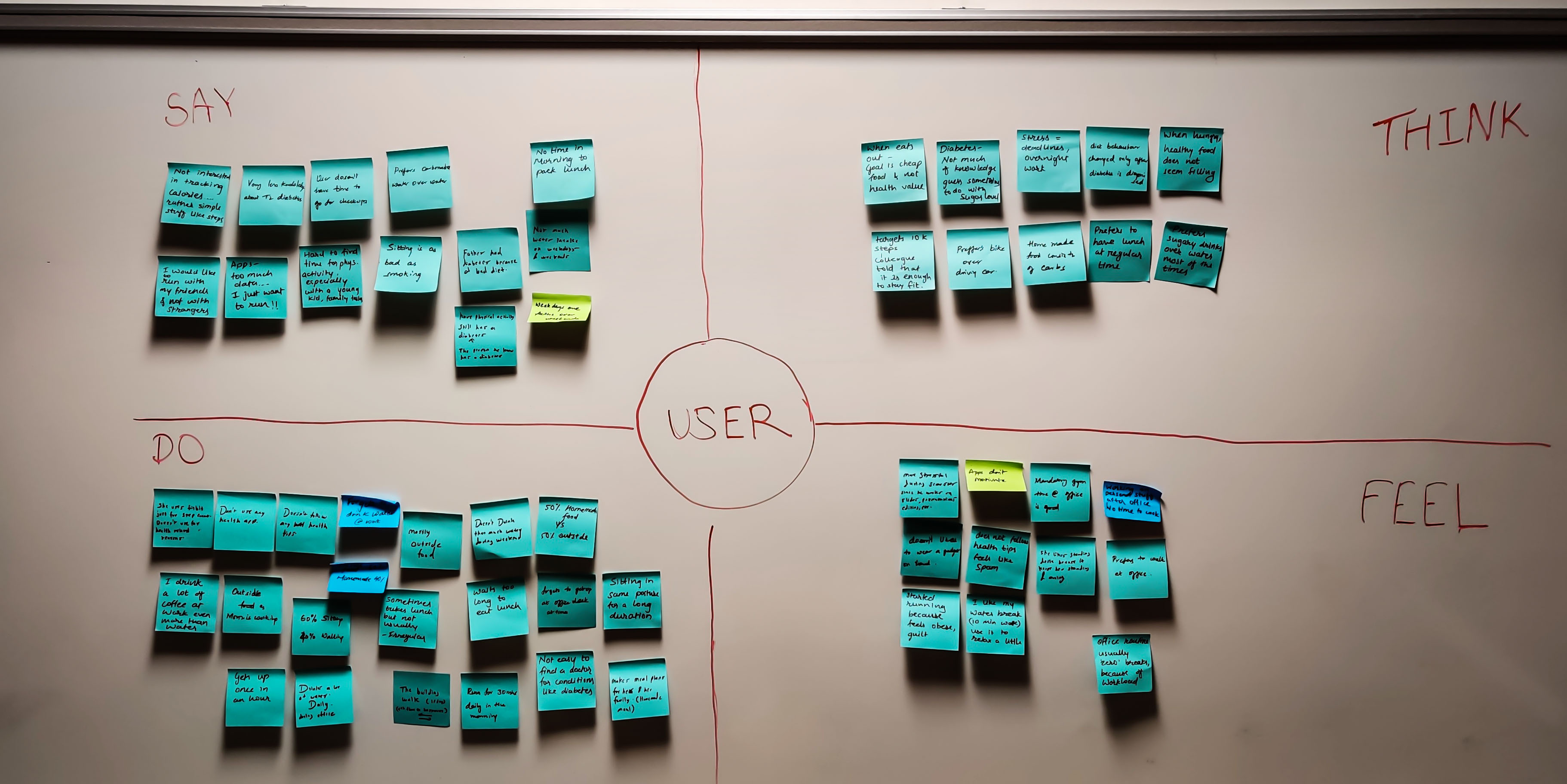
Empathy towards users
We then constructed an empathy map from the data collected during our user interviews. This exercise helped the team empathize with our target users and understand their behavior, motivations, and frustrations.
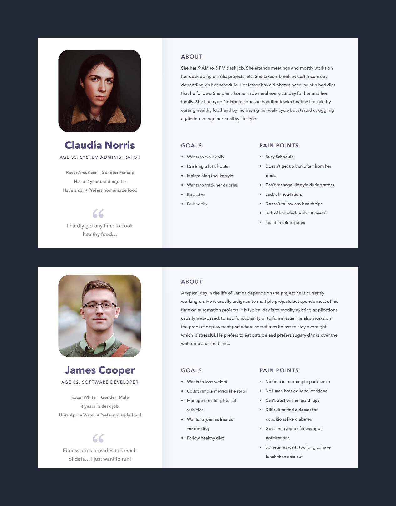
We then took a closer look at the empathy map and analyzed data collected from user interviews. Based on that data, we could formulate two user personas that represented our potential target users and captured their needs and frustrations. These personas served as a reference point for all of our next design activities.
User Persona
After getting data and insights from research and empathy map, we created personas that represented our potential target users and captured their needs and frustrations.
Findings from primary and secondary research
01.
Users don’t take regular health checkups due to busy daily schedule
02.
Users don’t take more than 30 mins break during the office timings
03.
Users are not aware of diseases that can happen due to prolonged sitting
Design
Once we had a clear picture of how the device and app were going to work together, we materialized our explorations into a prototype. For the Device prototype, we 3D printed the model and placed the required electric circuits. For the app prototype, we converted our wireframes to high-fidelity mockups and created an interactive prototype.
Device Prototype
Visual Designs
Evaluation
Since we had a novel design direction, we wanted to test it with our target users to gather useful feedback and find key usability issues. The evaluation of the design was necessary to learn how real users would interact with the system. Once the prototype was ready for testing, we had some objectives for the evaluations, and we needed answers to the following questions:
01.
How are the users feeling while using the product? Angry, frustrated, motivated? Can we measure the emotional aspect of the design?
02.
Is the nudge enough to move them from one place?
03.
What are their thoughts on visual feedback/light indicators?
04.
Does it address their pain points? Did the system behave as per their expectations?
05.
Does the user correctly understand feedback (lights/nudging)? Measure the learnability aspect.
06.
How was their first-time experience? Were the instructions clear? Was it easy to set up?
Usability evaluation with potential users
01.
All of the users who evaluated the product felt that it was an effective solution.
02.
Users can not customize snooze time. Currently, it is fixed to 15 mins. Users felt restricted.
03.
Users liked the insights provided in the activity page. Also, users felt that graphs to track weekly physical activities were easy to understand.
04.
Users felt that factors like tracking food intake and spreading awareness about potential health issues were missing from the application.


